Context
Hungry Wolf is a catering company established in 2017, specialising in corporate events, private gatherings, weddings, mobile bar experiences, and buffet delivery. Its client portfolio includes Yandex Music, Sberbank, Lukoil, and 12 Stores. By the end of 2023, analytics revealed a sustained decline in online orders. Despite website traffic growing +18% year-on-year, conversion continued to fall — from 1.8% in Q1 2023 to 2.4% by Q4. Bounce rate on the menu page climbed from 58% to 72%. Completed orders per quarter dropped from 284 to 192.
Challenge
The platform had four compounding problems. Pricing was hidden until step 5 of the order form — nine out of twelve research participants opened the form solely to find the cost, then left without purchasing. Menu composition was unavailable before selection: users had to request a PDF separately. The order flow spanned nine steps with no progress indicator. And there was no responsive mobile layout — buttons obscured content on screens narrower than 375px, despite mobile accounting for the majority of initial browsing sessions.
A heuristic evaluation against Nielsen's 10 principles surfaced 47 issues: 12 critical and 18 serious. The top five: no system status feedback when adding items; no filtering or sorting across 14 undifferentiated packages; a 9-step order form with no progress indicator; menu composition unavailable before selection; no responsive mobile layout.
Research and Problem Definition
Before any design work, I validated hypotheses through Yandex.Metrica and Yandex.Webvisor session recordings, which identified the three critical drop-off points that shaped the research focus.
Before any design work, I validated hypotheses through Yandex.Metrica and Yandex.Webvisor session recordings, which identified the three critical drop-off points that shaped the research focus.
I then conducted 12 in-depth interviews (60–75 minutes each) across two segments: 7 corporate event organisers — HR managers and office administrators running 1–4 events per year — and 5 event agency managers handling 10–30 events annually. Participants were recruited from the company's existing client base and LinkedIn.
218 interview notes were consolidated into 6 thematic clusters through affinity mapping. The findings were unambiguous: price was the primary barrier — users couldn't see it until the order form. Trust depended on two things: ingredient detail and authentic food photography. Organisers needed to substitute 2–3 dishes for allergies or dietary requirements, and the platform offered no path to do that without calling a manager. Mobile browsing was universal for initial exploration; desktop was used for comparison and checkout — but there was no way to save progress across devices. Availability anxiety was widespread: users couldn't see whether their date was viable from the menu page. And event agencies — representing only 12% of users — signalled strong loyalty potential if given an account dashboard with order history and volume pricing.
Solution
The core finding — price transparency as the single biggest conversion barrier — focused the redesign on one thing first: show the price before the user has to ask. Every other decision flowed from there. An information architecture restructure (informed by card sorting with 32 participants) reorganised 14 undifferentiated packages into three clear categories with per-person pricing on every card. The 9-step order form was compressed to 3 steps. And two underserved user needs — cross-device continuity and agency accounts — were addressed as dedicated features.
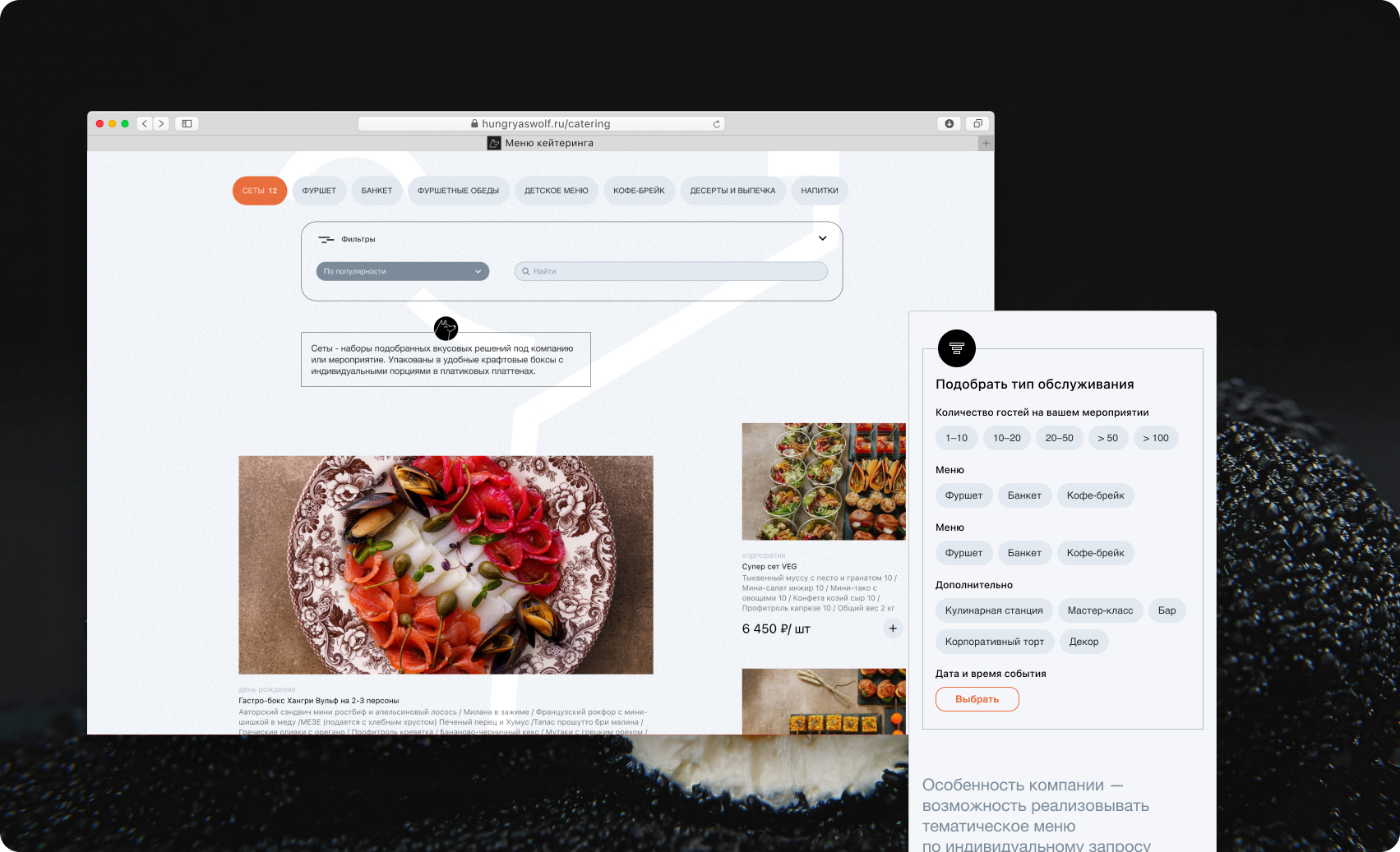
Catalogue and Pricing
The old catalogue was a flat list of 14 packages with no categories, no filters, and pricing hidden five steps into the checkout. The redesign addressed the primary drop-off point directly.
Per-person pricing on every card
Price was moved from the order form to the catalogue card. Filters by event type, budget, and guest count — plus allergen tags — let users eliminate irrelevant options before clicking anything. Users who previously opened the order form only to find the cost could now make that judgement from the catalogue.
Interactive menu page
The individual menu page was rebuilt as a decision support tool: full dish breakdown with individual photos, portion weights, and dietary markers (vegan / gluten-free / lactose-free). A live cost calculator updated in real time as the guest count changed, answering the question that had been sending users to competitors.
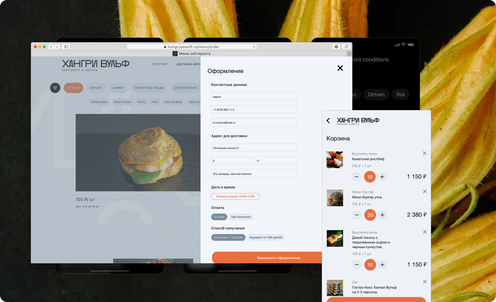
Order Flow and Cross-Device Continuity
The 9-step order form was the second largest drop-off point. Compressing it to 3 steps while preserving all necessary information required rethinking what the form was actually collecting.
3-step form with a persistent progress bar
Step 1: date and venue, with an inline availability calendar that addressed the anxiety users couldn't resolve from the menu page. Step 2: guest count and add-ons. Step 3: contact details and payment. The progress bar was always visible. Median checkout time dropped from 12 minutes to 4.5 minutes.
Dish substitution builder
Up to 3 dish substitutions per package: a dropdown of chef-approved alternatives, each updating the total price automatically. In two rounds of usability testing, no participant requested greater flexibility than this ceiling. The feature eliminated the most common reason users called a manager rather than placing an order online.
Save and continue later
After saving a menu selection, users received a QR code and an email link to resume on another device. This closed the gap between mobile browsing and desktop checkout — a pattern that appeared in every interview with corporate organisers.
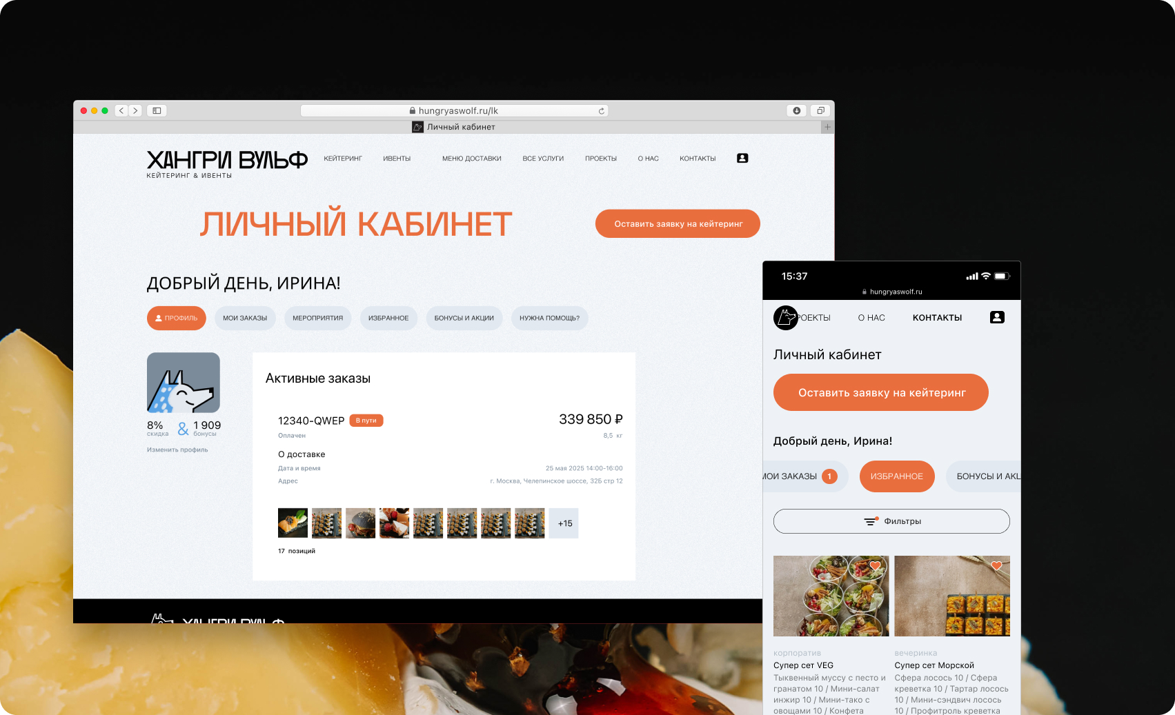
Agency Account Dashboard
Event agency managers represented 12% of users but signalled the highest loyalty potential in research — provided they had the tools to work efficiently at volume.
Order history, event templates, and partner pricing
A dedicated agency role unlocked order history, reusable event templates, and volume discounts of 8–12% from a threshold of 5 orders per quarter. In testing, the template feature was described as saving 2–3 hours per project. Three months post-launch, agency orders grew from 12% to 29% of total volume — with an LTV 6x above the platform average.
Outcome and Reflection
The platform launched in September 2024. Results cover October–December 2024 compared with the same period in 2023. Conversion rate moved from 2.4% to 3.8% (+58%). Homepage bounce rate fell from 72% to 41%. Average order value grew from ₽18,500 to ₽24,300 (+31%). Mobile order share increased from 18% to 54%. Platform NPS rose from 32 to 67. The agency dashboard proved to be the highest-leverage feature: a segment representing 12% of users generated 29% of orders within the first quarter, with an LTV 6x above the platform average.
'Finally, I can browse and pay without making a single phone call. I placed the order in 20 minutes straight from my phone.' Marina K., Office Manager
Reflection
Conducting research before any design work eliminated internal debate — every decision was grounded in evidence rather than opinion. Running card sorting early with real users saved approximately 3 weeks of IA rework. Focusing on a single critical problem (price transparency) rather than redesigning everything at once delivered measurable results quickly.
- Integrate session recording analytics from day one — Yandex.Webvisor was only activated in week 3, losing two weeks of behavioural data that would have sharpened the early hypotheses.
- A/B test two cost calculator layouts (inline vs. sidebar) rather than shipping a single variant. The calculator was the highest-engagement element post-launch; knowing which layout performed better from the start would have accelerated optimisation.
- Embed accessibility criteria for key user flows into the Definition of Done from the outset, rather than addressing them during QA.
Role & Responsibilities
UX Researcher / Product Designer — full cycle from research to developer handoff