Context
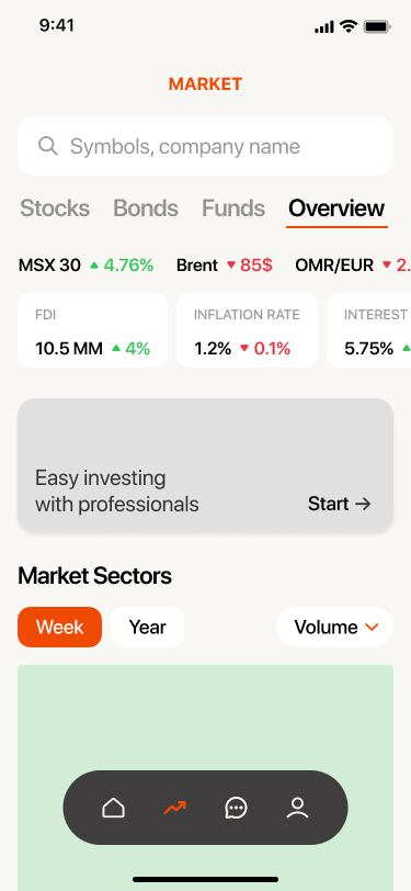
The Muscat Stock Exchange had just recorded its strongest performance in nearly a decade: trading value had risen fivefold to USD 8.45 billion, and the MSX index crossed 5,000 points for the first time in eight years. On the surface, the market was in robust health. Beneath the surface, however, the conversion data told a markedly different story. The brokerage platform was acquiring users at scale. It was not retaining them. Registration drop-off exceeded 60%. Median time from account creation to first transaction was 47 days. A significant proportion of funded accounts had never placed a single order.
Challenge
The initial brief was deliberately narrow: improve the onboarding flow and refine the asset browsing experience.
My first substantive decision was to challenge that framing to: 'The original scope assumed an execution failure: inadequate interface preventing ready users from transacting. Research would show the actual problem was strategic: the platform was designed for investors who already knew what they wanted. The majority did not.' However, there were non-negotiable constraints that shaped every design decision: the MCDC dual-registration requirement is CMA-mandated and immovable; the design could clarify it, but couldn't remove it; market data runs on a 15-minute delay; the product needed to disclose this honestly; compliance review added 3–4 weeks to any feature touching investment recommendations, which imposed a meaningful ceiling on how far the advisory layer could go in v1
Research and Problem Definition
Six in-depth interviews were commissioned through a specialist research agency with retail investors across Muscat: nationals and expatriates, complete beginners and active traders, aged 26–44. Findings were supplemented by three months of customer support data and a competitive audit of regional brokerage applications. I entered the research phase anticipating friction: confusing UI, excessive steps, weak hierarchy. What emerged was a more fundamental breakdown: a mismatch between what the platform assumed users knew and what they actually knew.

Six in-depth interviews were commissioned through a specialist research agency with retail investors across Muscat: nationals and expatriates, complete beginners and active traders, aged 26–44. Findings were supplemented by three months of customer support data and a competitive audit of regional brokerage applications.
I entered the research phase anticipating friction: confusing UI, excessive steps, weak hierarchy. What emerged was a more fundamental breakdown: a mismatch between what the platform assumed users knew and what they actually knew.
I deprioritised registration as the primary surface. The MCDC requirement is immovable; improvement there was marginal. The substantive leverage lay downstream: users who completed registration were not converting to first transaction. That was the more tractable and consequential problem.
The journey map revealed a bifurcation that defined the design strategy. Users split into two distinct modes that no single interface could serve effectively. Mode A 'Tell me what to do' and Mode B 'Help me decide myself'.
Solution
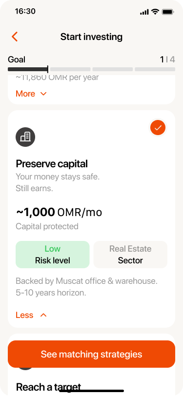
Two solutions emerged from the research. The 1st one is 'Ready-Made Investment Strategies' for users who want to invest without engaging with the underlying complexity and the 2nd one is 'Comprehensive Asset Card' for users who want to research and decide independently. The two solutions share a single underlying principle: confidence precedes action, and confidence is a design output, not a user prerequisite.
01. Ready-Made Investment Strategies
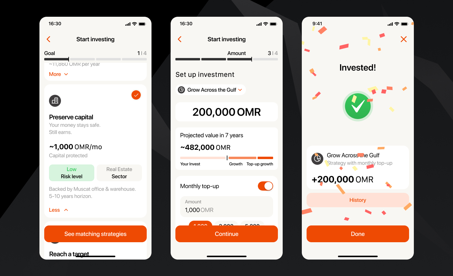
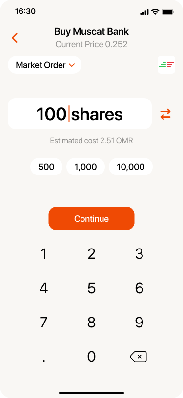
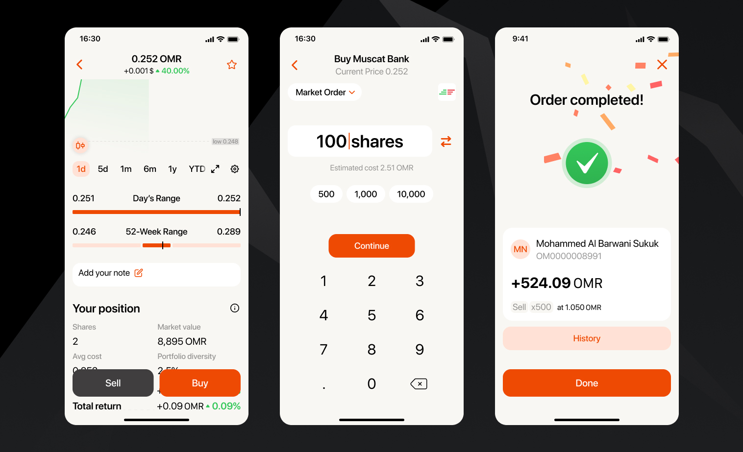
Users understood their financial goals but not the instruments available to achieve them. Beginning with goal selection eliminated the knowledge prerequisite and repositioned the decision as personal. In the interface, the investment entry point was restructured around four goal archetypes: grow savings, generate income, preserve capital, and reach a target amount. Each goal card displayed a plain-language description and a projected outcome range without referencing asset classes.
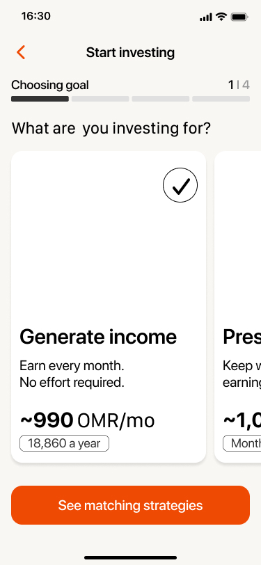
Goal-first architecture
Selecting a goal surfaced only the matching strategies, bypassing instrument selection entirely. Users who had previously abandoned at the asset catalogue proceeded to strategy confirmation within a single session.
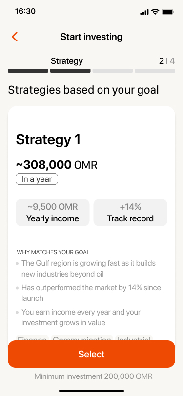
Named strategies with transparent composition
Named strategies outperformed bespoke portfolio generation in every test round. In personalised flows, users feared their answers were wrong and any resulting portfolio would reflect their errors. Named strategies transferred the construction burden from user to platform. Rejected: an algorithmic personalised portfolio, developed to prototype stage. Flagged by compliance as requiring a financial advice licence. Replaced with curated strategies, which attract a lighter regulatory burden.
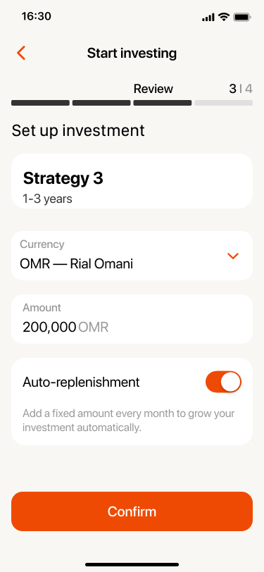
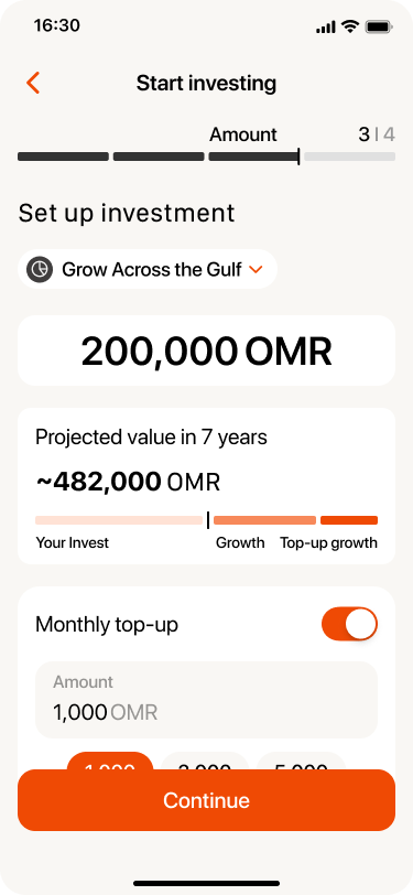
Auto-replenishment as the default
Users who established a recurring contribution schedule were substantially more likely to remain active at 90 days. I positioned auto-replenishment as the default mode, with manual investment as the opt-out. The PM resisted as 'too pushy'; an A/B test on onboarding copy resolved the debate. Rejected: Surfacing auto-replenishment only after the first confirmed transaction. Testing showed most users never reached it.

02. Comprehensive Asset Card
Experienced users systematically left the platform to explore securities from the outside, and returned only to complete transactions. The asset card has been redesigned as a decision support tool based on the real questions that the investor asks, rather than on the data fields contained in the database.
An audit of asset cards on Oman's brokerage platforms revealed a persistent problem: the order of the card fields is in accordance with the output from the database, and not in accordance with the needs of users. The bond card displayed the price, dynamics, market activity, company information, credit quality of the issuer, and coupon information before moving on to the two numbers that most accurately answer the question "should I buy this?"
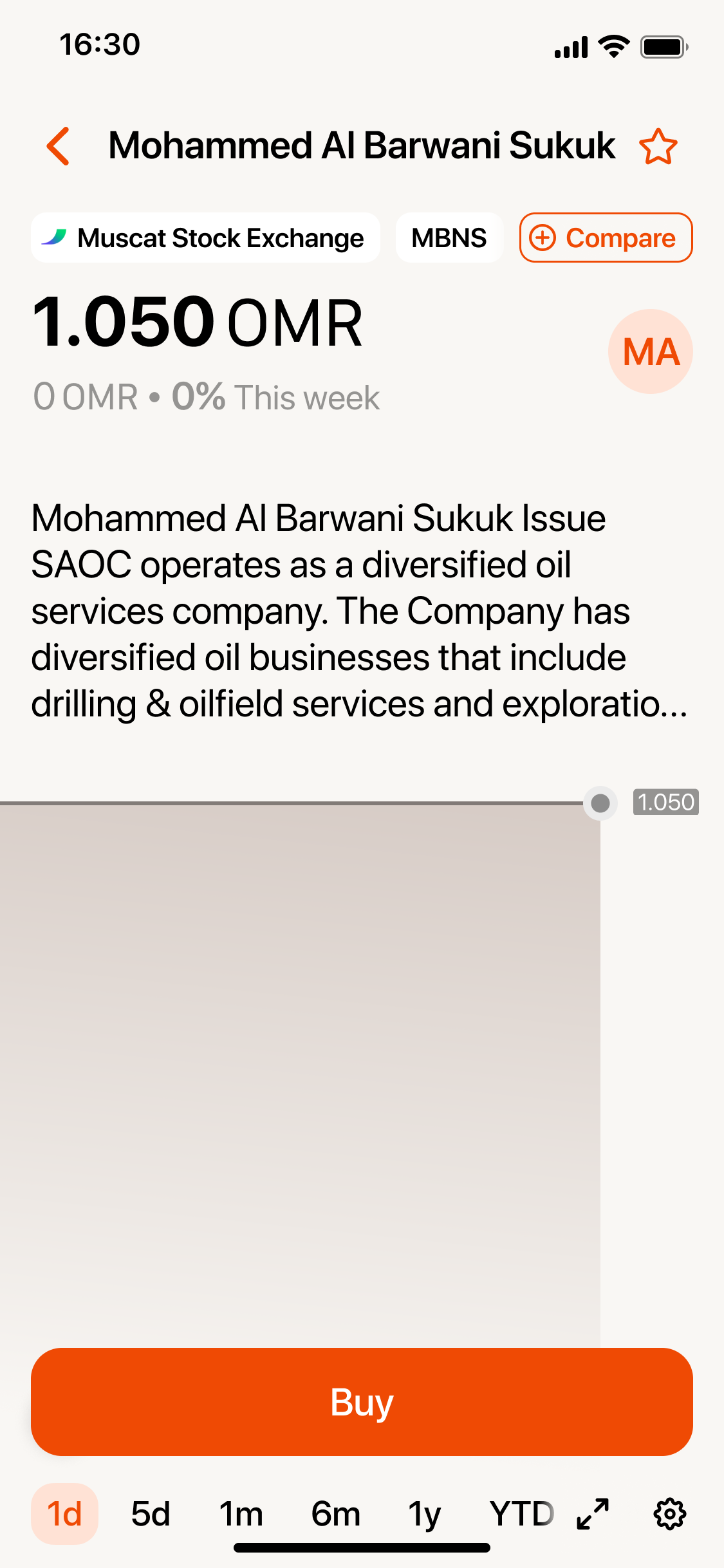
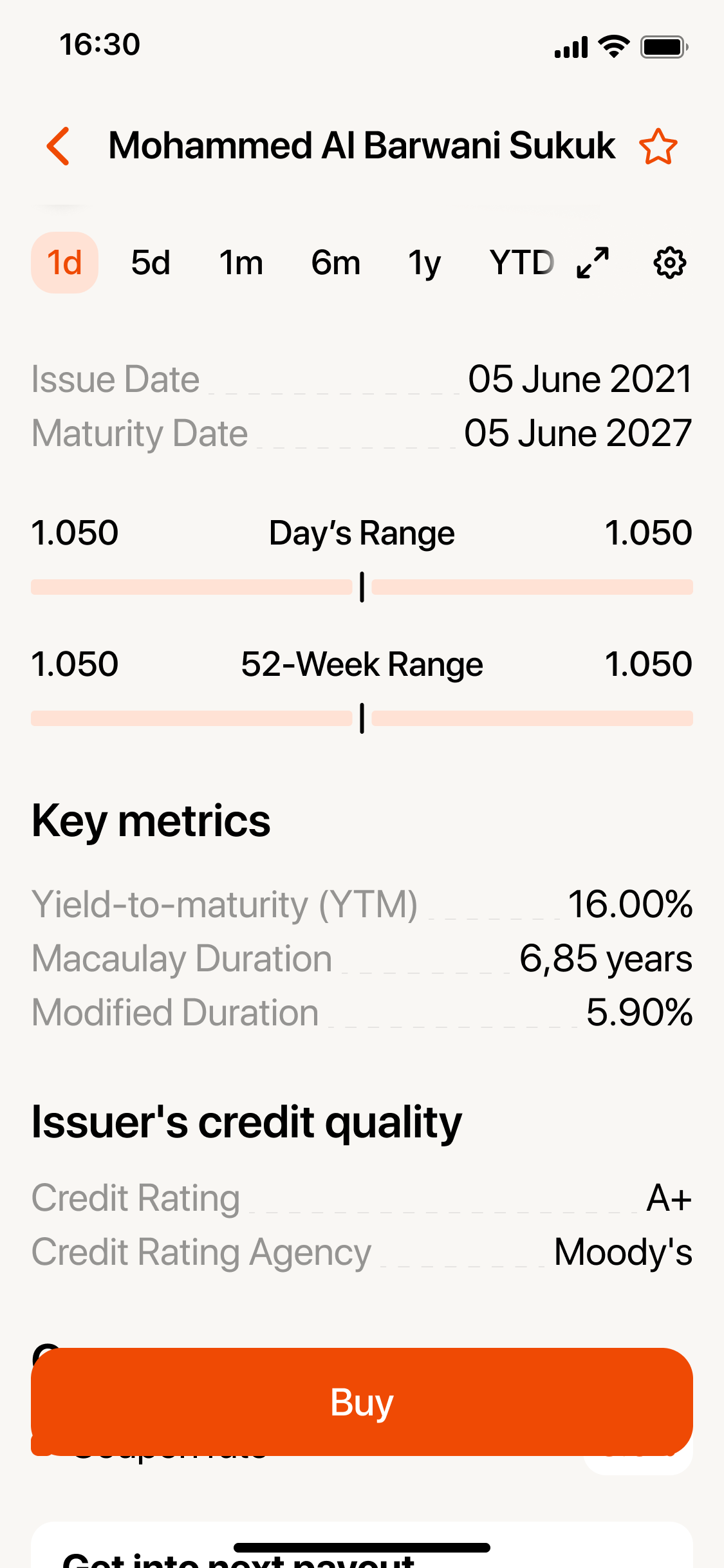
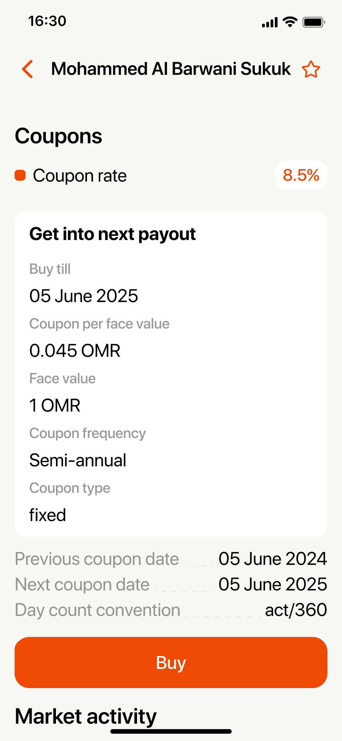
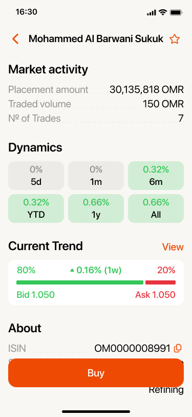
Question-first card architecture: user questions replaced data categories
Existing cards ordered fields by database output. The redesign restructured each card around questions investor asks before committing money: what is this, how risky is it, is now a good time, what do analysts think, what happens if I buy, and when was this priced. The reordering required no new data, only a different hierarchy.
Analyst consensus positioned below the user's own data layer, not above it
Existing apps either omitted analyst block entirely or placed it prominently above raw data. The redesign placed analyst consensus as a secondary layer — available, but after the user had formed an independent view from facts. The assumption: users who anchor on analyst opinion before reading the underlying data do not develop the judgment to evaluate whether that opinion is reliable. Rejected: Analyst rating as a headline figure at the top of the card. Testing showed users anchored heavily on the consensus rating and stopped reading.
Outcome and Reflection
Two rounds of usability testing (14 participants) and a staged 5% rollout preceded full release. Success metrics were defined before design began to preclude post-hoc rationalisation. Strategy path users showed a 2.3x higher 90-day retention rate relative to users who navigated directly to asset browsing. These were the metrics that held commercial significance; the usability figures above served as leading indicators.
'I finally understood what I was choosing. For the first time it felt like a decision, not a guess.' Layla, returning participant

Reflection
The investment profile questionnaire that feeds the strategy recommendation was the weakest part of the design. Asking users to characterise their own risk tolerance in the abstract produces unreliable data — people describe how they want to see themselves, not how they would actually behave when their portfolio drops 20%. I knew this at the time and made a concession to speed. Given another pass, I would replace it with scenario-based questions built around simulated historical drawdowns: show users what their portfolio looked like at its lowest point and ask how they felt, not how they think they would feel. The asset card was stronger, but the scenario calculator — the field that converted abstract percentages into a concrete OMR outcome — was positioned last. In testing it consistently produced the strongest reaction, the moment where users shifted from hesitation to intent. It should have been first.
- Constraints are design material, not impediments. The data delay, the MCDC step, the regulatory ceiling — each became an opportunity once I stopped trying to obscure it.
- Confidence is a product deliverable. For many users the job is 'feel capable of making a financial decision at all' not ‘transact efficiently'.
Role & Responsibilities
Lead Product Design