Context
In 2021, a significant wave of retail investors in Russia found their securities and financial instruments blocked — assets that could no longer be freely traded due to rapidly shifting regulatory and market conditions. These users held positions in depositories and investment houses, but had no self-service path to move those assets. The only option was to contact a support agent and navigate the process manually — slow, inconsistent, and unscalable. My Investment, a mobile-first brokerage app, needed to give these users control. The brief: design a self-service blocked asset transfer flow, entirely within the app, that would allow users to initiate and complete a transfer to a different depository or investment house — without human intervention. Simple in concept. Brutally complex in execution.
Challenge
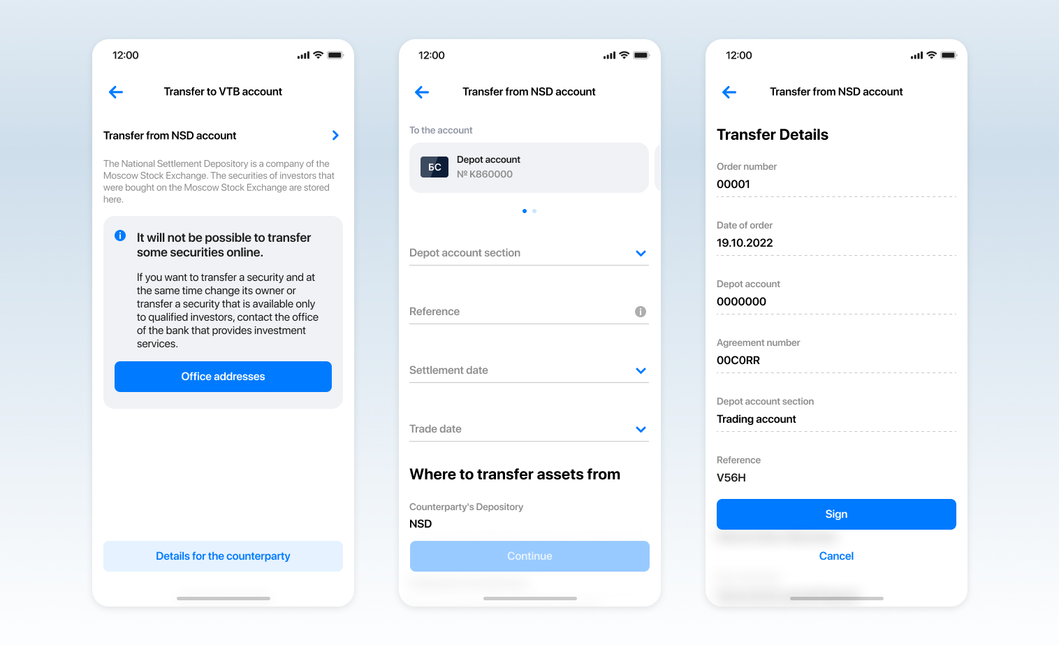
An asset transfer is not a two-party transaction. It involves multiple participants, each with their own systems, validation rules, and data requirements: the user's current depository, the receiving depository or investment house, the bank's own backend infrastructure, and compliance and regulatory layers that could not be bypassed. None of these parties could share data with each other programmatically in real time. There was no API that let the backend pre-populate what depository a user's asset was held in. Most of the data had to be entered by the user, validated manually downstream, and passed from party to party in a structured form — because that was the only path that all parties would accept.
The backend could not bypass or pre-fill the data those systems required. Simplification was not an engineering decision that could be made alone — it required agreement from all parties, and that agreement did not exist within the timeline.
Research and Problem Definition
I began by mapping the end-to-end asset transfer process: every party involved, every data point required, every validation step. I ran user interviews to understand what users knew about their own assets — and the gap was stark. Most users did not know their asset codes. Many did not know which depository held their securities. The information existed, but not in a form users could recall on demand.
I began by mapping the end-to-end asset transfer process: every party involved, every data point required, every validation step. I ran user interviews to understand what users knew about their own assets — and the gap was stark. Most users did not know their asset codes. Many did not know which depository held their securities. The information existed, but not in a form users could recall on demand.
My first design reflected what the research suggested: a clean, guided flow that fetched known data from the backend, presented users with contextual choices, and minimised manual input. We tested it. It performed well. Users found it intuitive. Then I took it to the technical and legal teams.
The initial design assumed capabilities the backend did not have. Pre-populating asset locations required data-sharing agreements with external depositories that did not exist. Smart defaults required real-time lookups that were not feasible within the infrastructure.
Solution
I was the only designer on this project, with 1–2 months until launch. The options were clear: delay launch and invest months in backend work and inter-party agreements while users remained blocked or deliver a comprehensive, manual-input flow that is cumbersome but technically sound, document what was sacrificed, and build the improvement roadmap. We chose to deliver. A working path even an imperfect one was infinitely better than no path at all.
Where We Broke the Rules
The final design knowingly violated multiple of Nielsen's 10 Usability Heuristics. I tracked each one explicitly for the post-launch improvement roadmap.
Recognition over Recall
Users had to know their asset codes and depository location from memory — data not surfaced in the app. Mitigation: Added an in-app guide showing where to find each piece of required information and what it means.
Flexibility & Efficiency of Use
No autocomplete. No ability to save progress and return. Mitigation: Structured the flow into named stages so users knew how far along they were and what remained.
Aesthetic & Minimalist Design
Screens were dense with required fields — some screens collected 6–8 data points. Mitigation: Grouped related fields into logical blocks; used progressive disclosure where technically possible.
User Control & Freedom
The multi-party process was largely linear — limited ability to go back a stage. Mitigation: Clear back navigation within stages; explicit warnings before destructive actions.
Stakeholder Alignment Under Pressure
Agreeing on this approach required more than a design decision. It required convincing multiple parties — the product manager, engineering leads, and representatives from the depositories and investment houses — that a manual-input flow was the right path forward.
The ideal design as a communication tool
The original user-tested design became a communication artefact. I presented it alongside the technical constraints to show stakeholders not what had 'failed' to be built, but what the ideal state looked like and what we were committing to pursue post-launch. Showing the ideal design alongside the possible design was more persuasive than defending the compromise alone. It demonstrated that the compromise was intentional, a response to real constraints.
Outcome and Reflection
The blocked asset transfer feature launched within the 2-month deadline. For the first time, users of My Investment could initiate and complete a blocked asset transfer independently, through the app, without contacting support. The multi-party process ran as designed. The flow was cumbersome. That was known going in. But 'cumbersome and working' was a fundamentally different user reality than 'not available at all.'
Shipped pragmatism beats perfect design: a functional flow with transparent trade-offs and a clear improvement roadmap delivers more user value than waiting for perfect system integration.

Reflection
Most portfolios show the clean path: research, insight, elegant design, happy metrics. This project required operating well when the clean path was not available: systems thinking across multiple external parties, stakeholder alignment under pressure, and the judgment to know when shipping something imperfect is the highest-quality decision you can make.
- Start multi-party constraint mapping on day one. The technical wall I hit mid-process should have been a discovery output, not a design revision trigger.
- Negotiate a phased data collection approach from the start — some manual inputs could have been pre-filled with more upstream coordination before design began.
- Document usability trade-offs formally as a design decision record, shared across product, engineering, and leadership not just in design files.
Role & Responsibilities
Senior Product Designer