Context
National Reserve Bank is one of Russia's most established private banks — a name synonymous with reliability among high-net-worth clients and institutional investors. Its mobile app serves a demanding audience: clients who manage not just current accounts, but brokerage portfolios and investment advisory relationships from a single interface. In a high-rate environment, the bank launched a new deposit product designed to capture client capital at scale. The product was genuinely compelling: a multi-currency deposit with interest rates ranging from 15.07% to 17.11% depending on term, with the added flexibility of linking returns to the Central Bank of Russia's key rate — and a choice between monthly interest payouts or a lump sum at maturity. The challenge: this product was complex. Its value was real, but not self-evident.
Challenge
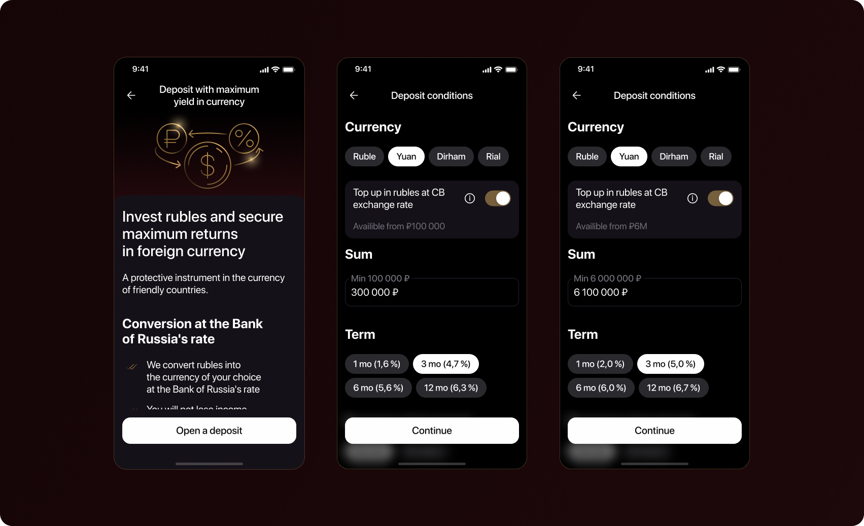
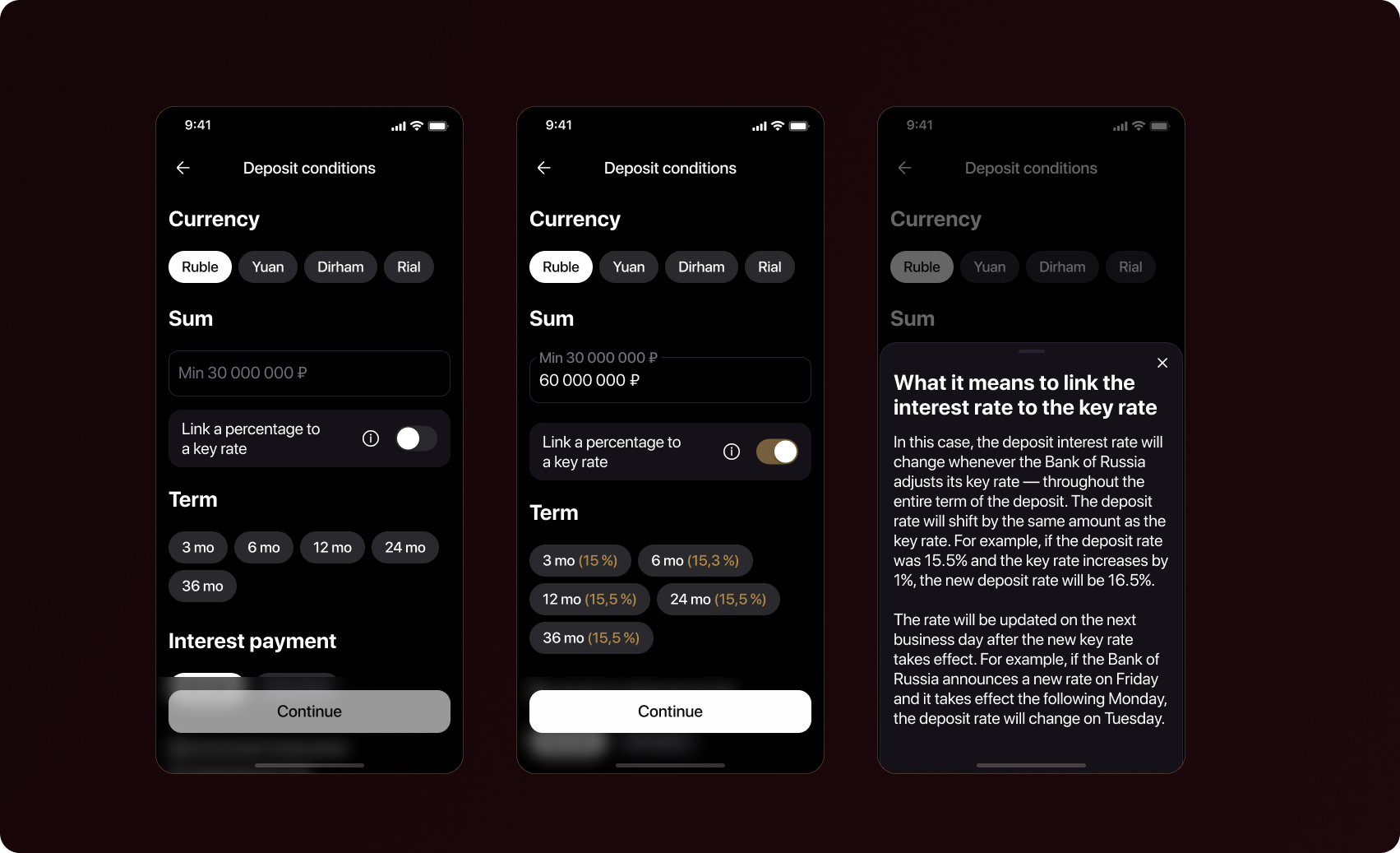
The deposit had four meaningful variables a user needed to understand before committing: currency (each with different rate structures), term (duration directly affected the interest rate across several tiers), payout mode (monthly income vs. at-maturity accumulation), and rate linkage — the option to tie returns to the CB key rate, adding a variable-rate dimension to what might otherwise seem like a fixed product. Users needed to explore — to see what their specific amount would yield under different configurations — before they would trust the product enough to open it. The calculator was not a supplementary feature. It was the conversion mechanism.
In the two-person development team, I was responsible for multi-currency deposits: a structurally complex version of the product in which linking the interest rate to the key rate of the Central Bank transformed the deposit from a simple fixed-income instrument into something closer to a financial product with interest rate indexing. This required the calculator to report not just a fixed yield, but a range — and to do so in a way that created confidence rather than uncertainty.
Research and Problem Definition
Before the calculator existed, the bank's only discovery path was a consultant-prepared PDF. For a high-net-worth client expecting digital-first access, that was a meaningful barrier. The initial brief was clear: show all options to all users. Maximum visibility, full upfront exposure. After years of curated PDFs, the business wanted the opposite. Research and analytics said otherwise. When users saw every currency, term, and rate configuration at once, they didn't compare — they left. NRB's client base isn't homogeneous, and the interface wasn't accounting for that. I proposed personalisation by loyalty tier: standard clients saw fixed-rate, single-currency configurations; mid-tier clients got progressive access to multi-currency and rate linkage; premium clients saw the full quasi-monetary path as a default.
Before the calculator existed, the bank's only discovery path was a consultant-prepared PDF. For a high-net-worth client expecting digital-first access, that was a meaningful barrier. The initial brief was clear: show all options to all users. Maximum visibility, full upfront exposure. After years of curated PDFs, the business wanted the opposite. Research and analytics said otherwise. When users saw every currency, term, and rate configuration at once, they didn't compare — they left. NRB's client base isn't homogeneous, and the interface wasn't accounting for that. I proposed personalisation by loyalty tier: standard clients saw fixed-rate, single-currency configurations; mid-tier clients got progressive access to multi-currency and rate linkage; premium clients saw the full quasi-monetary path as a default.
Solution
Relevance is a form of respect. Showing a client only the options that are meaningful for their profile is not limiting it signals that the product understands them. The impactful decision in this project was showing less, more relevantly, would outperform showing more, indiscriminately. That required evidence, a clear alternative, and the willingness to push back on a stated business requirement.
The Calculator Design
The deposit had a mechanic most users had never encountered: you invest in rubles, the bank converts them into the currency of your choice at the Bank of Russia's official rate, interest accrues in that currency monthly, and payouts arrive back in rubles at the CB key rate on the day of crediting. The principal is protected in currency terms. There is no tax on exchange rate differences, only on interest. You can close at any time without losing the deposit amount. A standard product card with a rate and an Open deposit button would not do it. The calculator had to teach the product while personalising the outcome.
Communicating the CB key rate mechanic without anxiety
The rate-linkage mechanism was the single biggest communication risk. Telling a client their return depends on the Bank of Russia's exchange rate on the day of crediting can read as uncertainty, the kind that sends cautious investors elsewhere. The design resolved this by anchoring the explanation to what the user does not lose: the deposit amount in currency is protected regardless of exchange rate movement. The framing shifted from 'your return may vary' to 'your capital is held in currency, the Bank of Russia rate only determines how it arrives back to you in rubles.' A contextual tooltip expanded on this mechanic for users who wanted the full picture, without making it mandatory reading for users who were already comfortable.
From calculator to application
Once a user had configured their scenario: amount, currency, projected monthly return, the interface resolved into a persistent summary card with a single primary action: Open This Deposit. The card remained visible as the user scrolled through the product conditions, so their personalised outcome was always in view at the moment of decision.
What Made This a Senior Design Problem
What made this a senior design challenge was everything underneath the surface of a simple input-output tool.
Business influence
The most impactful decision in this project was not a visual or interaction choice. It was the argument that showing less, more relevantly, would outperform showing more, indiscriminately. That required evidence, a clear alternative, and the willingness to push back on a stated business requirement.
Product complexity
Four interacting variables, including one (key rate linkage) that introduces genuine financial uncertainty. Making this feel clear, not confusing, required deliberate communication design, not just interface design.
Scope ownership
As the designer responsible for the quasi-monetary deposit path, I owned the structurally complex variant of the product end-to-end — the information architecture, the rate communication model, and the transition from calculator to application flow.
Outcome and Reflection
The calculator launched as the primary entry point for the new deposit product. The average deposit size of more than ₽30 million is the most significant figure — it reflects the calculator's effectiveness at engaging NRB's core high-net-worth client base and giving them a credible, personalised path to committing significant capital. The loyalty-tier personalisation was central to this: the clients with the largest balances saw the product positioned correctly for their profile, which increased both their confidence and their commitment size. The deposit calculator became a reusable design pattern for subsequent product launches at NRB. The loyalty-tier personalisation model was adopted as a product principle — not just for deposits, but for investment product entry points across the app.
The decision to personalise by loyalty tier was the right call, and the results confirm it. It required sustained effort to get there: 'Show everything' is a natural default for businesses launching new products — it feels like risk mitigation. The harder argument is always the one that says: trust your segmentation, surface less, and watch conversion improve.

Reflection
If I were approaching this again, I would build the segmentation case earlier — bringing analytics data on abandonment rates by client tier into the first stakeholder conversation, rather than after the initial brief had been set.
- Build the segmentation case with data before the first stakeholder conversation — not after the brief has been set. Having that data earlier would have shortened the alignment process considerably.
- Instrument the calculator more granularly from day one: track which variable users changed most, where they spent the most time, and at what configuration they converted.
- That granular data would have accelerated iteration on the rate-linkage communication, which still had room to improve.
Role & Responsibilities
Senior Product Designer — owner of the quasi-monetary deposit path