Shiba

Web

Concept Design
Visual Identity
Japanese Aesthetics
UI / UX
Dog-Friendly Restaurant
Delivery Platform
Concept Design
Visual Identity
Japanese Aesthetics
UI / UX
Dog-Friendly Restaurant
Delivery Platform
The Brief

A digital experience
as considered as
the cuisine itself

SHIBA is a premium Japanese restaurant on Moscow's most iconic boulevard. Fresh fish flown from Japan, twelve varieties of sashimi, ten sushi. A chef bar, a dog at the door, and an audience that notices when something is off.

The brief: design a complete digital ecosystem — restaurant homepage, online delivery catalog, and mobile ordering app — that carries the atmosphere of the physical space into every screen. Three services, one visual language, zero compromise on feeling.

Client
SHIBA — Japanese cuisine, Dog-friendly. Two Moscow locations.
Deliverables
Restaurant homepage · Delivery catalog · Product pages · Reserve a table (desktop + mobile)
Challenge
Unify three distinct services (Restaurant / Delivery / Shop) in one coherent brand experience without any feeling like an afterthought
My Contribution
Full visual concept development from brief to final screens
The Concept

Not a template.
A point of view.
Built from a brief.

01 — Origin

Japanese ink as visual language

The concept began with sumi-e ink painting — the Japanese art of expressive brushwork in which negative space is as important as the mark. Every screen carries ink splatter elements and kanji characters (柴 · 道 · 幸福) as a decorative layer that is deliberate but never loud. Handmade texture in a digital context.

02 — Accent

One colour, used precisely

Torii red (#C8392D) is the single accent across the entire system — used for the brand mark, the "+ ADD TO CART" action, price highlights, and navigation indicators. Its restraint is intentional: red only appears when something matters, which means it always lands.
03 — Tension

White space as a design choice

Premium restaurant UI often makes the mistake of filling every pixel. The SHIBA concept inverts this: air and restraint are the brand signals. Typography is sparse, photography is the hero, and the UI steps back. The result is an interface that feels as considered as the menu itself.

Design Philosophy

"The screens should feel like an extension of the space — somewhere you'd want to spend time, not just click through."


Shiba Inu — the restaurant's brand character
Central Concept — Brand Character

The dog
is the brand

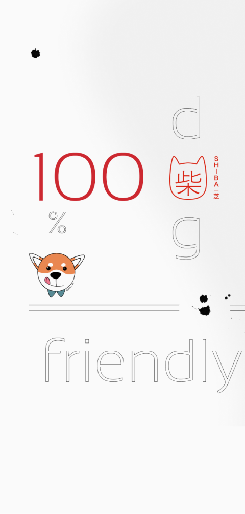
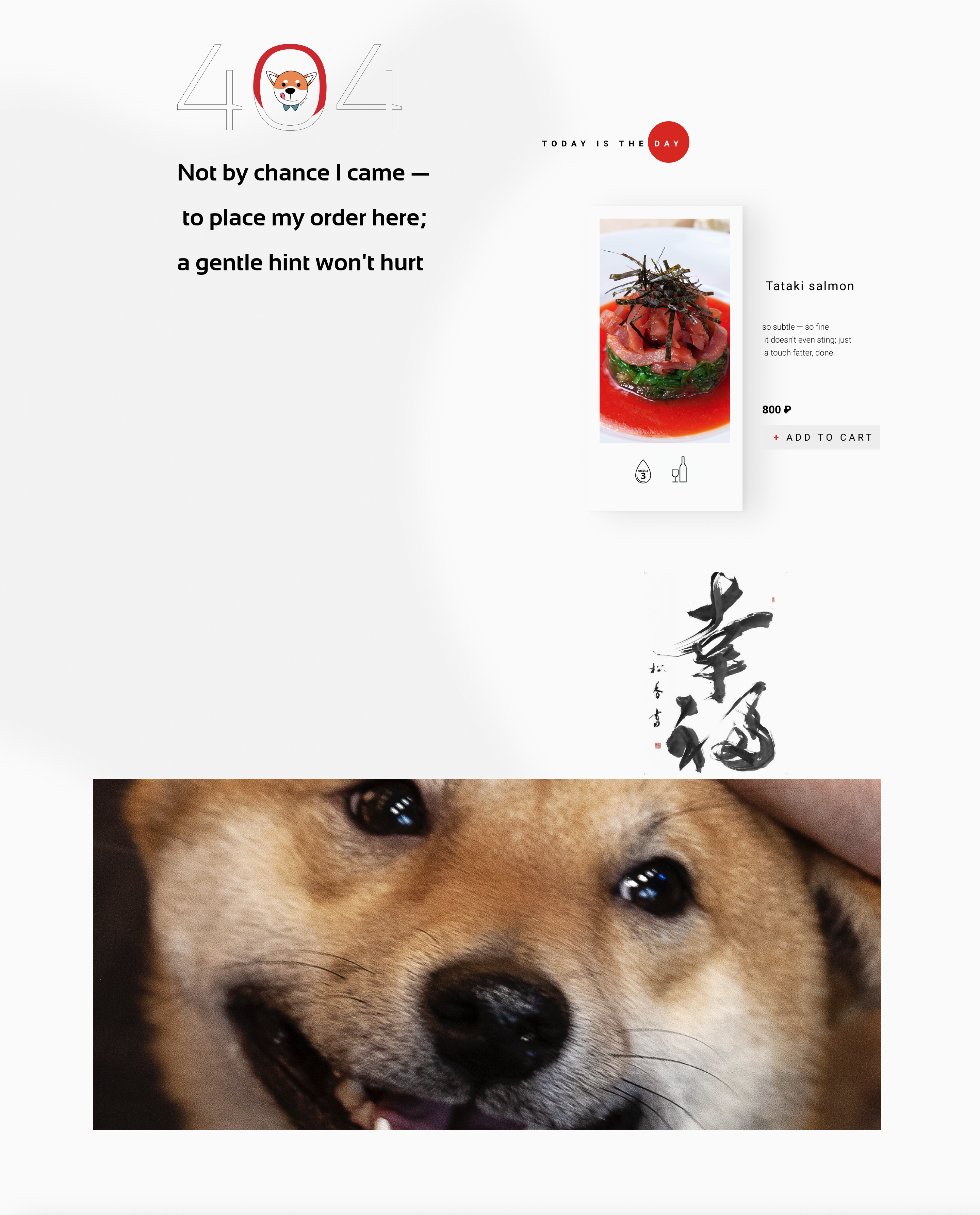
SHIBA is dog-friendly — but that's not a policy statement, it's a personality. The Shiba Inu dog is the emotional heart of the entire digital experience, appearing on every page: a smiling close-up anchors the delivery catalog, a full-width portrait closes the homepage, and the brand mark is a stylised dog icon drawn in red.

This was a deliberate concept decision made from the brief. Rather than treating the dog-friendly policy as a footnote in the "About" section, I made the Shiba a character — present, recurring, structurally embedded in the scroll rhythm of every surface.

The effect: a premium Japanese restaurant that feels genuinely warm and approachable. For dog-owners, it's an immediate signal of belonging. For everyone else, the dog adds disarming charm without softening the food-first aesthetic.

Present on every screen — not a mascot, a character
Visual System
Ink Black #111110
Torii Red #C8392D
Rice Paper #F2F0EB
White #FAFAF8
Dark Footer #2B2420
Display — Headings & dish names
Chirashi
Salmon
DM Serif Display — warm, food-editorial. Used for all dish names and section headers. The slight ink quality of the letterforms matches the sumi-e concept.
UI — Navigation, labels & price
RECOMMENDED · DELIVERY
10.68 $
Seared salmon fillet with spicy sauce, steamed rice, unagi sauce
DM Sans — neutral, precise. Wide tracking in uppercase UI elements. Light weight for body copy. Keeps the interface from competing with the photography.
Decorative Texture — Ink & Calligraphy Layer
Sumi-e ink splatter
Sumi-e ink splatter
Brand kanji — 柴 (Shiba)
Kanji — 道 (Path / Way)
幸福
Kanji — 幸福 (Happiness)
The Screens
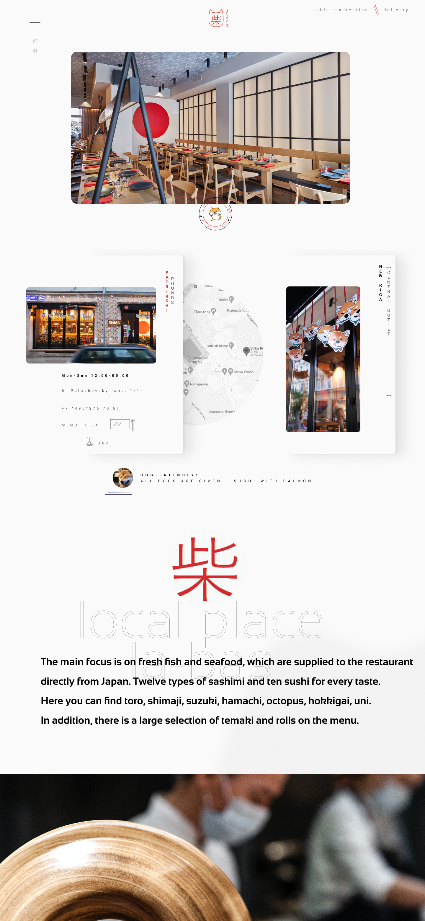
01 Restaurant Homepage Desktop
Restaurant homepage mockup

Restaurant interior hero, kanji 柴 in red, chef profiles, delivery preview — one scroll, three services.

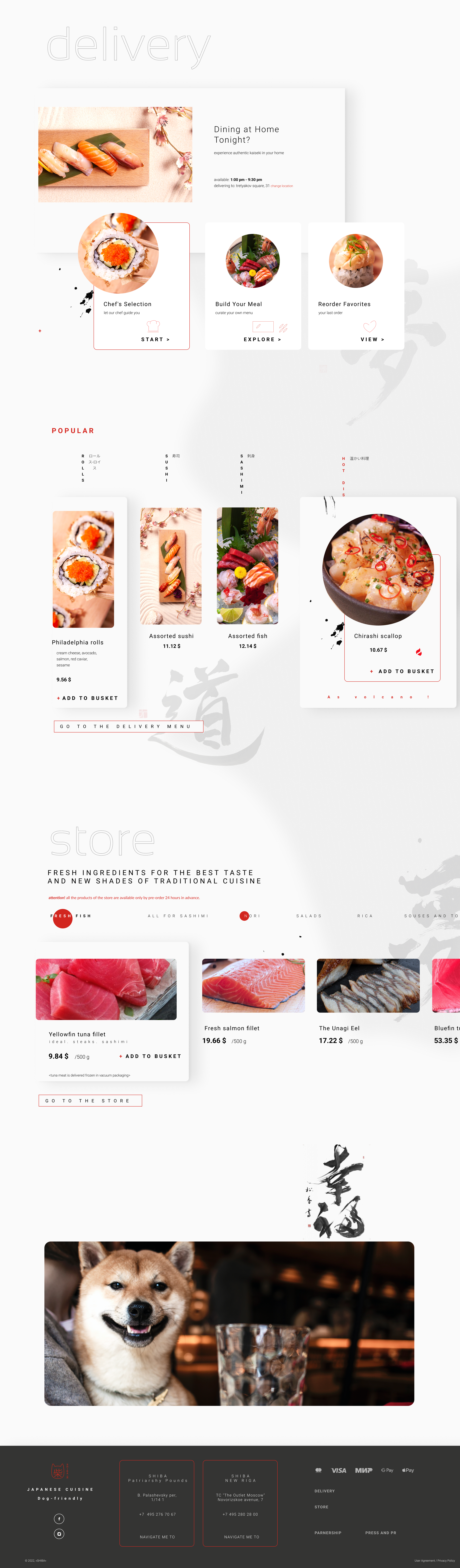
02 Delivery Catalog & Mobile Ordering Desktop + Mobile
Delivery catalog desktop mockup

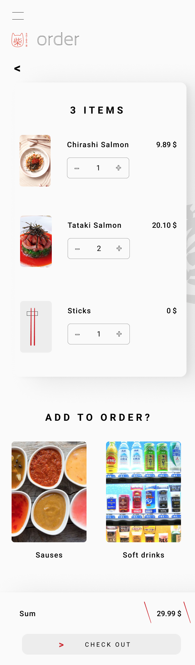
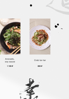
Desktop favors browse-and-compare: a dense grid, hover states, and a persistent cart counter. Mobile drops the grid for a single-column, thumb-first flow — the cart and checkout become full-screen steps rather than overlays, so the order never gets lost behind a modal.

Mobile cart and order screen
Cart & Order
Mobile checkout screen
Checkout
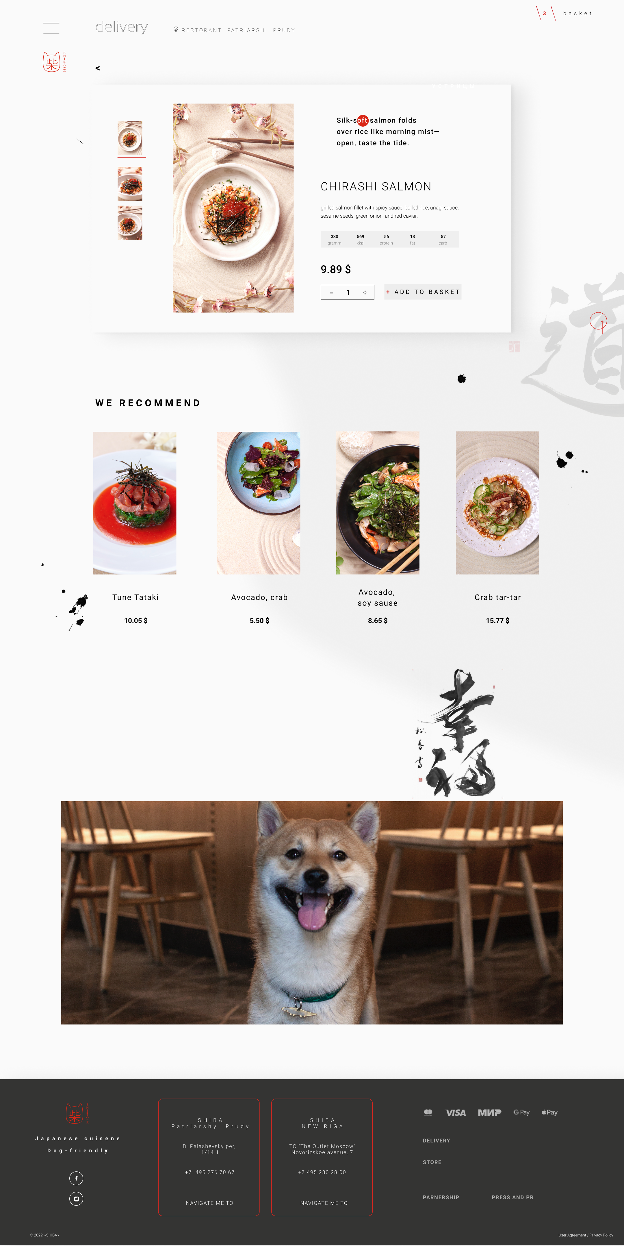
03 Delivery. Working with the Menu Desktop + Mobile

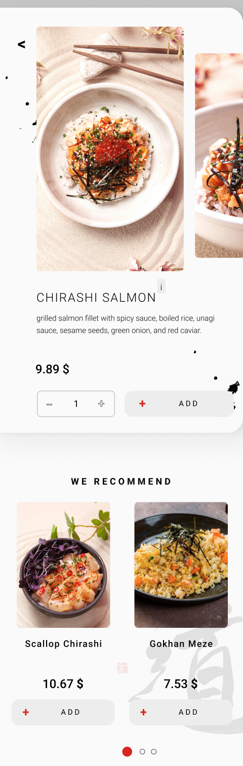
Once a dish is open, the menu becomes a decision-support tool rather than a static description: full dish breakdown, portion weight, dietary markers, and a live quantity selector that updates the running total before checkout — the same logic carried from the dense desktop layout down to a single thumb-reachable column on mobile.

Delivery dish detail desktop mockup
Mobile menu catalog scroll
Menu Page
Mobile dish detail screen
Dish Detail
Mobile basket and checkout screen
Loading
Design Decisions
01
The dog appears
on every page
Not as a mascot pinned to a corner, but woven into the structural scroll rhythm: a smiling close-up in the delivery catalog, a full-width portrait closing the homepage, a dog-icon brand mark. The Shiba is a character — warming a premium space without softening its authority.
02
One accent colour,
used sparingly
Torii red appears exactly where action is required: the "+ ADD TO CART" button, the cart counter, active navigation states, and the brand mark. Nowhere else. Its restraint is what gives it power — every red element on screen is something that matters.
03
Upsell without
disruption
"We recommend adding" increases basket size commercially, but is designed to feel editorial — a row of suggestions in the same card style as the rest of the page. No modal, no popup, no banner. The commerce is invisible.
04
Desktop and mobile
as equals
Mobile is not a stripped-down desktop. The delivery catalog uses a 2-column thumb-friendly grid on mobile and a 4-column dense grid on desktop — same content, different composition. Both feel native to their context, not adapted.
Shiba 404 page
This is what I do

Concept first.
Visual always.
Brief to screens.