Syrovarnya is a Novikov Group restaurant concept rooted in rustic farmhouse cooking, with in-house soft-cheese production at the heart of the menu. The format proved scalable, and a single dining room grew into a chain operating across several Russian cities.
The website did not grow with it. It was built for one venue: a homepage, a menu and a reservation form. Two shifts exposed its limits. Lockdown turned delivery from a secondary feature into a core business channel almost overnight. At the same time, a growing base of regulars kept raising two needs the site could not meet: browsing the full menu before booking, and quickly finding the right location among many.

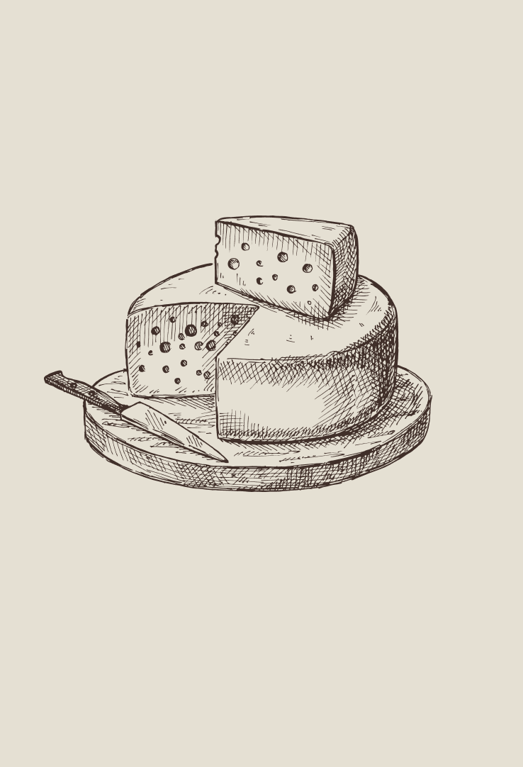
The concept starts with the restaurant's own cheese production: hand-drawn, cross-hatched illustration in the style of a farmer's ledger, rustic paper texture, and dish photography treated as the hero rather than as decoration. The site is designed so no page feels like a chain outlet. Every page should feel like the original dining room, wherever it is opened.

Sunny Gold is the single accent across the entire system: the brand mark, the "Reserve a Table" action, price highlights, and active navigation states. Everywhere else, the palette stays close to cream and rye brown, so gold reads as a signal for one thing only: a decision point.

As Syrovarnya added cities, the navigation had a real risk of fragmenting into a wall of tabs: one per location, one per new request. The concept holds that line instead. Three clear top level destinations carry the whole product, with location picking folded into delivery and reservations rather than turned into a maze of its own.
"The moment a restaurant becomes five restaurants, the menu is not the hard part. The navigation is."
Syrovarnya did not ask for a redesign. It asked for delivery, fast, because lockdown had just made the dining room the least reliable way to reach a customer. That request landed first and shaped everything that followed. Delivery became a top level destination, not a banner bolted onto the homepage.
What followed was not a plan so much as a pattern of requests. Regulars wanted to browse the full menu before they booked, not request a PDF. Customers in other cities wanted to confirm which Syrovarnya was theirs before they picked up the phone. Rather than answering each with a new tab, both needs were folded into the destinations already in place. Menu gained depth, and Delivery gained a city and location picker.
Franchising came last, once the chain itself became a story worth telling on its own: a third door, for people who wanted to open a Syrovarnya rather than eat at one.
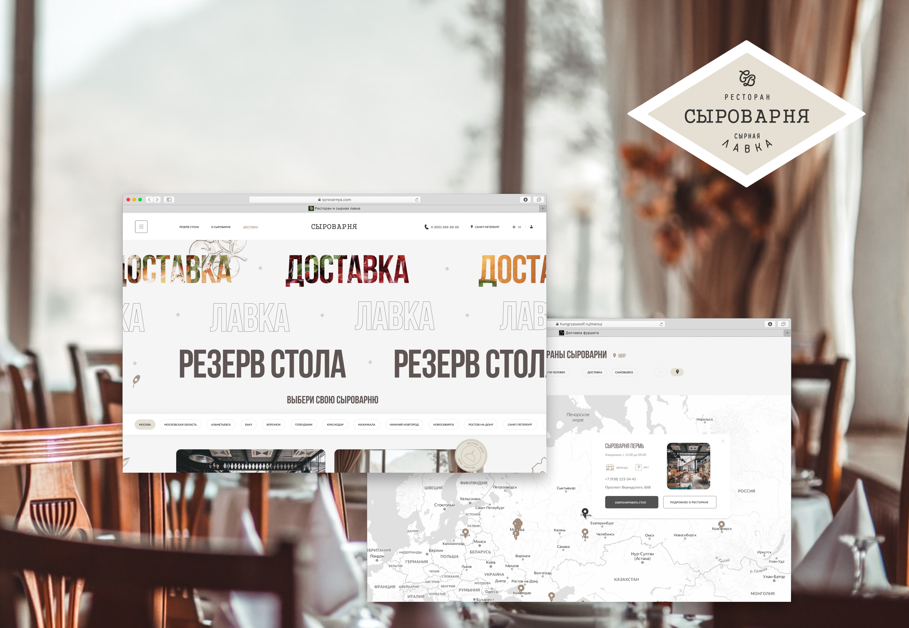
The three top level destinations, Доставка (Delivery), Резерв стола (Reserve a Table), and a city picker spanning Moscow to Rostov on Don, sit in the same header at the same visual weight. No destination reads as an afterthought to another.
On mobile, ordering and booking share the same visual grammar, so moving between them never feels like leaving the site. The delivery menu is browsable with a running cart, and the reservation flow leads with the room itself: photo, hours, and a one tap route, before it ever asks for a date.
A delivery menu with per-dish weight and price, a persistent cart with running total, and on the same trip, restaurant contacts, hours, and a "Reserve a Table" action that never competes with checkout.